I'm going to try something new. The first picture is of the regular outline that I do for every painting. The second is a "brilliantly" designed diagram of my why I chose the composition for this piece.
When I was in school (undergrad), one of my teachers told me that one of the rules that you should always try to follow is to never put a circle in the upper right hand corner. It attracts the viewers eye directly to it. The only time you should is if you want the viewers eye to go there. For this piece that's exactly what I wanted (the pie), but I'm always nervous that the rest of the composition will get lost. So to combat this I tried to make the entire middle of the page one giant circle. You can see this in my awesome diagram (yes, these are the same skills I used to get into Pratt's graduate design program).
I also liked that the pie (circle) was resting on the tentacle which was acting as a giant arrow. The color choices that I make will also play a part in making this a whole painting. But that's for another day.
Tuesday, May 20, 2008
Sunday, May 18, 2008
Drop That Pie Henry!
Here's the sketch for my new painting. It's a page from the book dummy that I'm currently making. In this part of the story Emily is trying to keep Henry from eating all the pies. The sketch is the original thumbnail so there really isn't any detail.I thought about fleshing out the sketch more, but I'm incredibly impatient and wanted to start right away. Normally I would never do this because I hate not knowing exactly what I'm doing before I start. I added a background to give it some context.
I'm Back
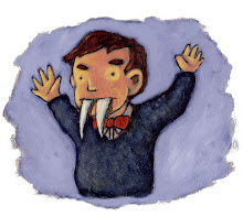
It's been a while since the last post. Sorry about that. I was busy with work and finishing my portfolio and application to grad school. I was accepted a couple weeks ago, and now I can focus on my painting again. Here's a sketch I did last night. I'm not sure what I'm going to do with the character. It just makes me laugh. I think it's because he looks like some grizzled veteran.
I'll have photos of the painting I just started up soon.
Tuesday, March 4, 2008
New Sketch
Saturday, February 16, 2008
Getting Kids to Read
This is an older piece that I had forgotten about, but recently found buried beneath stuff. It's based on an idea that I had back in college. I'm not sure why I never did it then, but it's probably for the best. I'm not sure it would have come out this good if a 21 year old me tried to do it. Anyway, I have some new Gorilla Detective sketches that I'm working on. I'll post those soon.
Thursday, February 7, 2008
Gorilla Detective - Done!!
Ok, I think this is finally finished. For some reason, I encountered a ton of problems with this painting. It felt like every decision I made was the wrong one. Thanks to grad school applications, I got to step away from it for a while, and I think that really helped. Instead of making a lot of big changes while I was frustrated, I made a calm, rational one...I just lightened the sky. It might not seem like a big deal, or even show up in the photo, but this made everything better and now I can sleep at night. So yeah, here's Hank Gorilla: Gorilla Detective. Enjoy.
Saturday, February 2, 2008
I'm Back
Sorry about the lack of posts. I just finished all my applications to Grad School. So, now I can get back to Illustrating. I'm going to finish the gorilla painting this weekend (I hope), and I'll put that up during the week. For now, here's a portrait of Orson Welles I did for someone awesome.
If anyone cares, there's a little inside joke in this painting. On the pipe are the letters TL - which stand for Turkey Leg. We (meaning me and the "client") used to joke about what happened to Orson Welles. He started out as a dashing young director who made the greatest movie ever, then somehow gained 100 pounds, grew an awful beard and was the voice of Unicron in the Transformers movie. What happened was all the turkey legs he ate. That's what did him in.
Thursday, January 17, 2008
Is this done?!
I'm not sure if this painting is done. I want it to be done, but is it done. I'm still not happy with the orange text. But I've tried other colors and none seem right. Should I cut it out all together? Or would that then make the painting feel empty? Plus, if I do get rid of it, I feel like it'd be harder to know what exactly the painting is about. Any feedback would be great.
Wednesday, January 9, 2008
Gorilla Detective - The Painting Pt.1
Normally, I would break this up, or post it as I was going along, but the holidays and work have gotten in the way. So, unfortunately this is going to be one long post. We'll start with the outline. For whatever reason, I developed this way of working. I love line work, and this seemed like the best way to preserve the original energy of the sketch. I should also mention that I use a projector to blow up the sketch. Then I put Acrylic medium over the pencils. Then the black outline.
Then I do a quick burnt sienna under-painting, to help me figure out the tones, and what the brightest/darkest object is. When I was in school, for some crazy reason, I never did an under-painting. Then one of my teachers told me how dumb that was. Thanks Fred!
This is just the first couple coats of paint. I like to work dark to light, and really build up the colors. Does anybody work light to dark? Is that even possible?
This last one is where I'm currently at. I can't seem to get the tie right. I wanted it to be bright and tacky, but it really looks crazy. It's like something the Joker would wear. Anybody have any suggestions? Hopefully I'll have some more stuff soon.
Subscribe to:
Posts (Atom)